Artists Bridging the Gap: Mural Training Program (2025)

Exploration
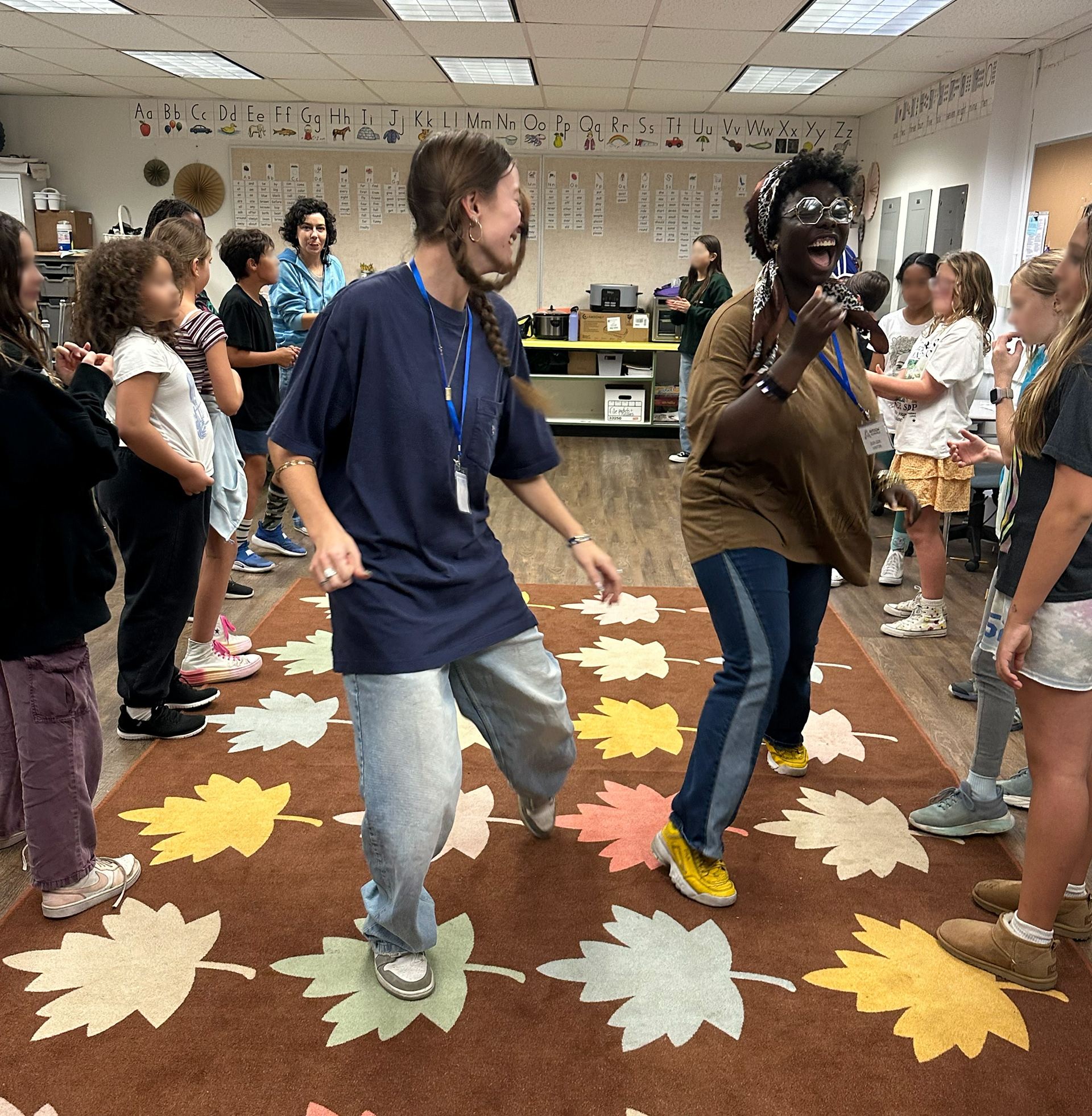
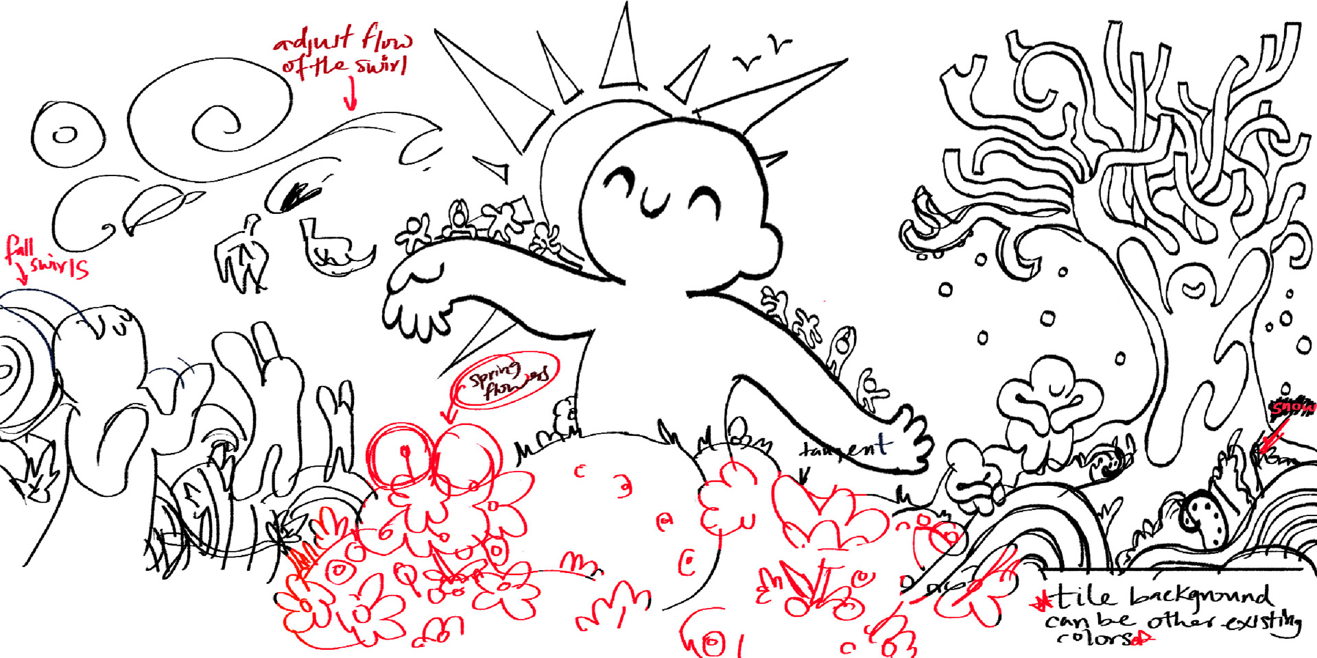
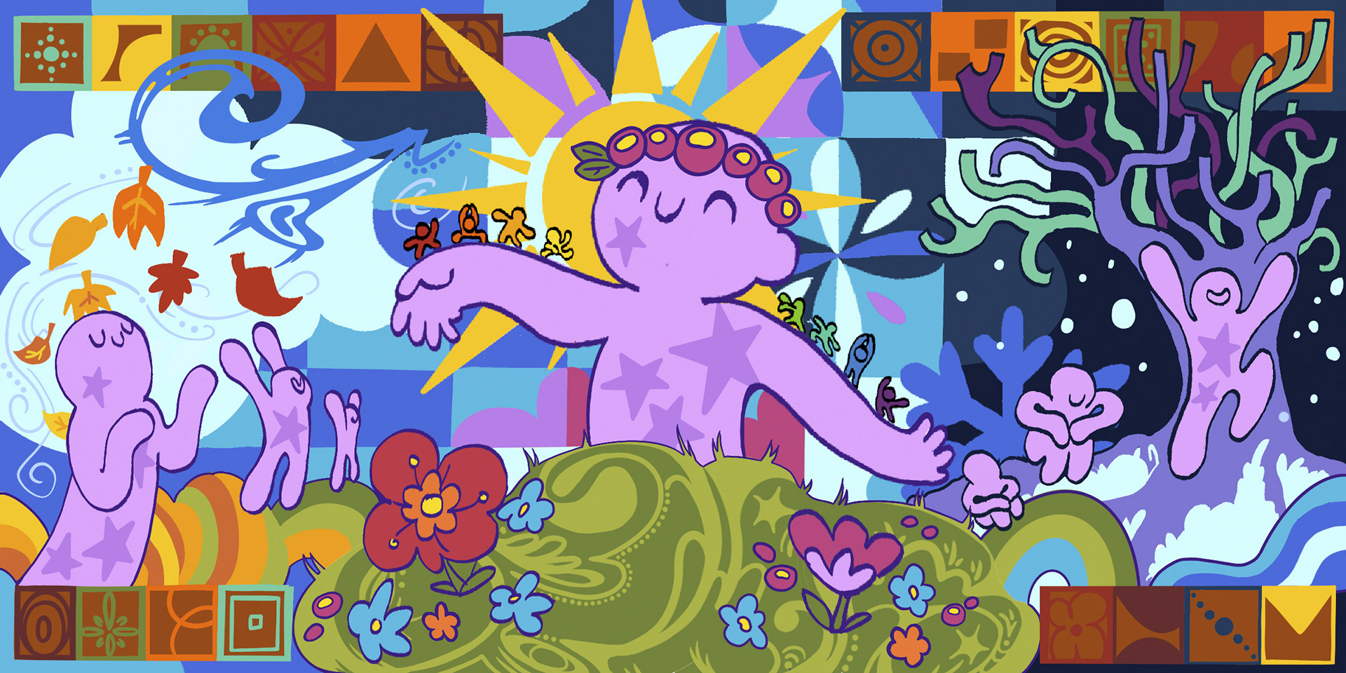
Before sketching any ideas, I stepped into classrooms where students embodied seasons, weather and elements through movement. Their interpretations of nature, along with the emotional energy in the room, showed me how children make sense of experiences too big for language. Being fully present with them allowed me to observe their rhythms, curiosity and resilience, all of which shaped the tone of the mural.
Research
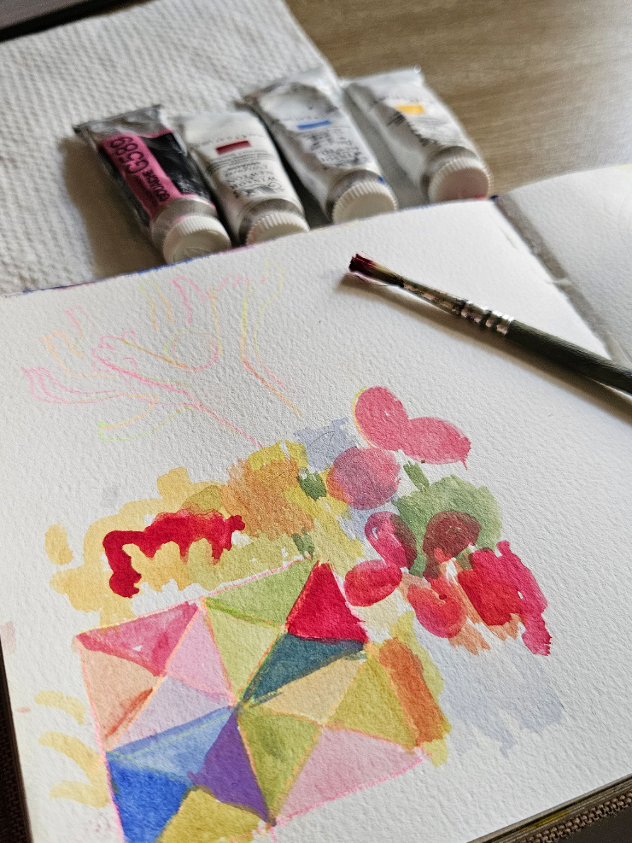
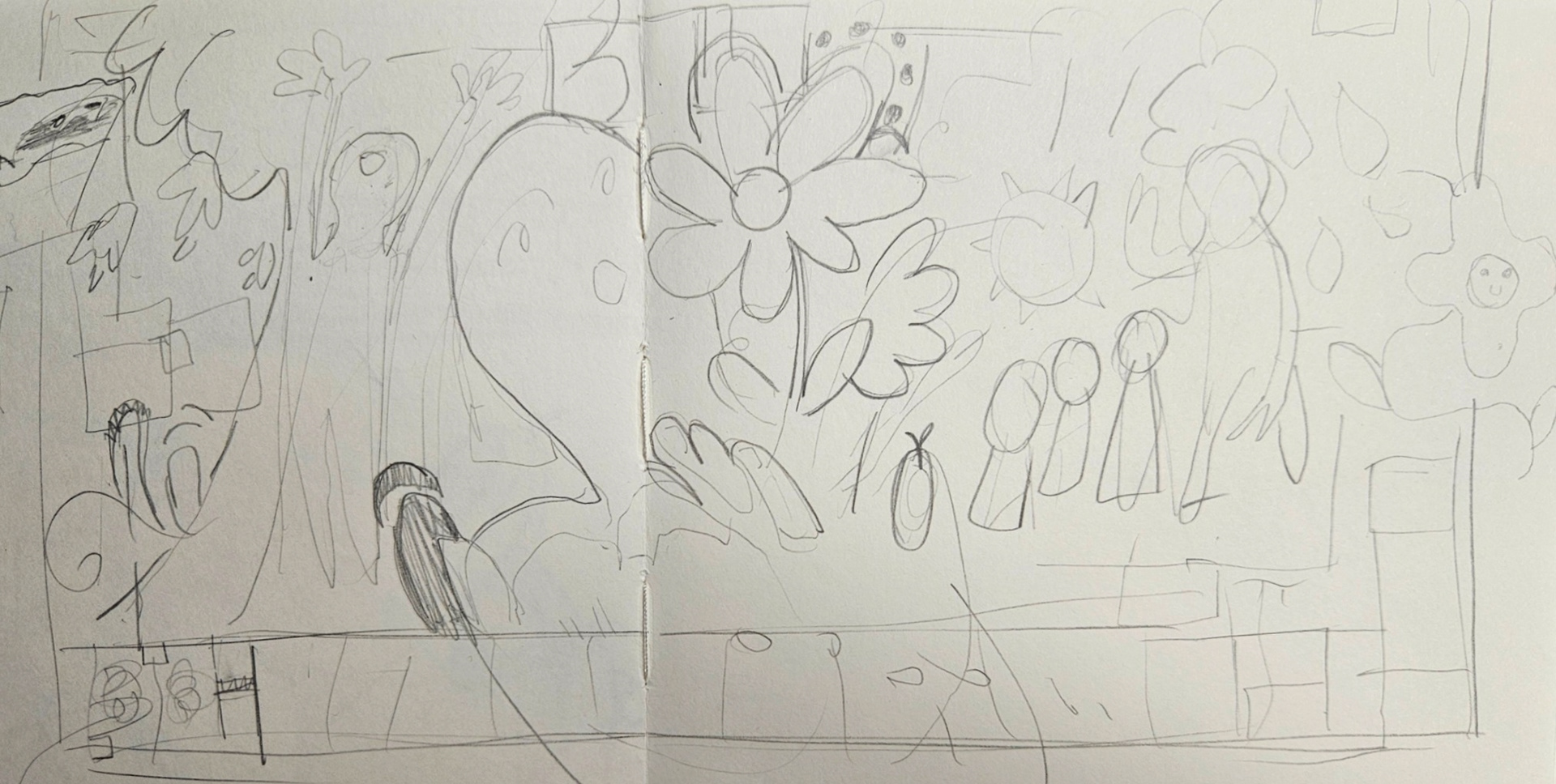
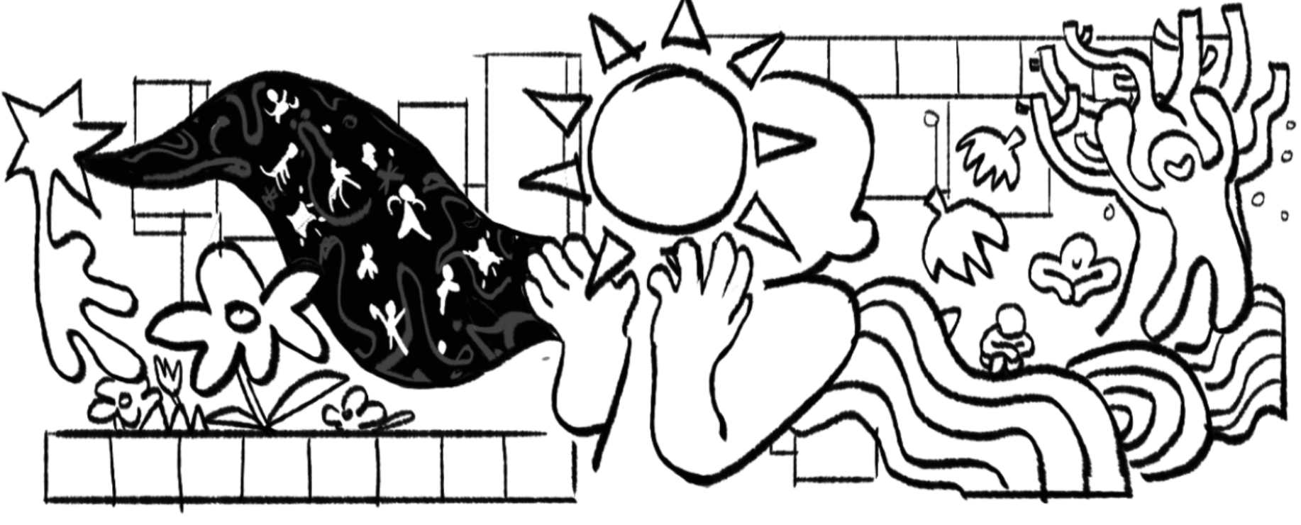
The design became a synthesis of movement, community history and natural cycles. I focused on capturing a sense of presence, where people and seasons shift together in a shared moment. Incorporating references to local tiles and the Pasadena–Altadena landscape helped ground the piece. My goal was to create a mural that allowed children to participate joyfully while representing the strength and interconnectedness of their community.
Designed by Oak Bediako and Ruby Kontos
Scanlon Mural Project (2021)
Origins
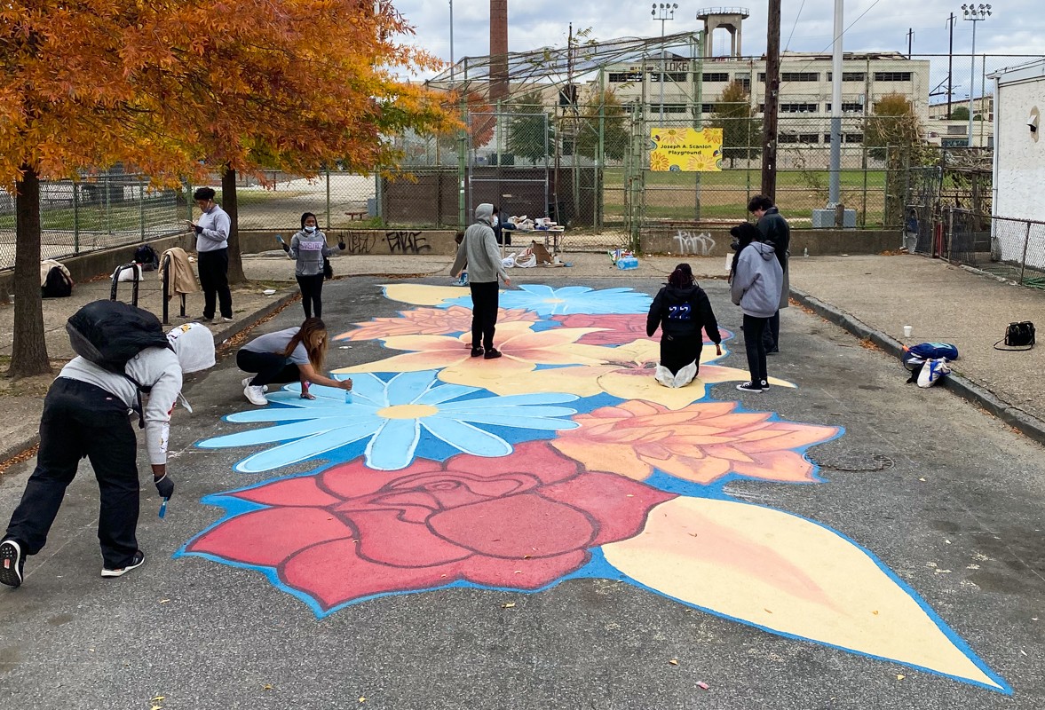
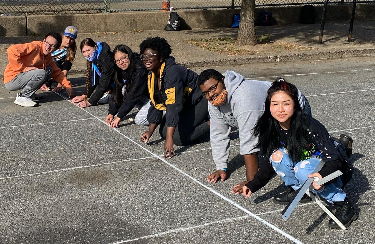
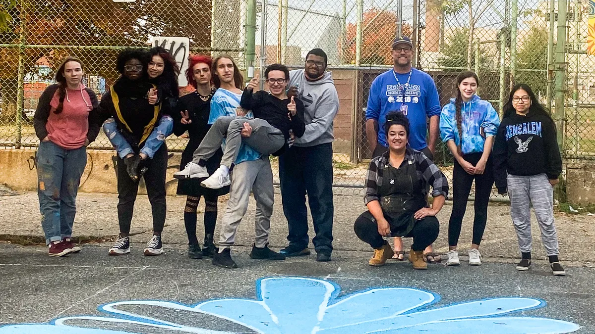
Working on the Scanlon Playground mural was my introduction to creating public art with a purpose beyond myself. As students from Bensalem High School and Mastery Charter Lenfest Campus collaborated, I learned how murals can transform a simple playground wall into a space that invites connection. Even in the early planning stages, I could feel how art could bring people together, especially in a neighborhood that wanted color and care in the places where kids play.
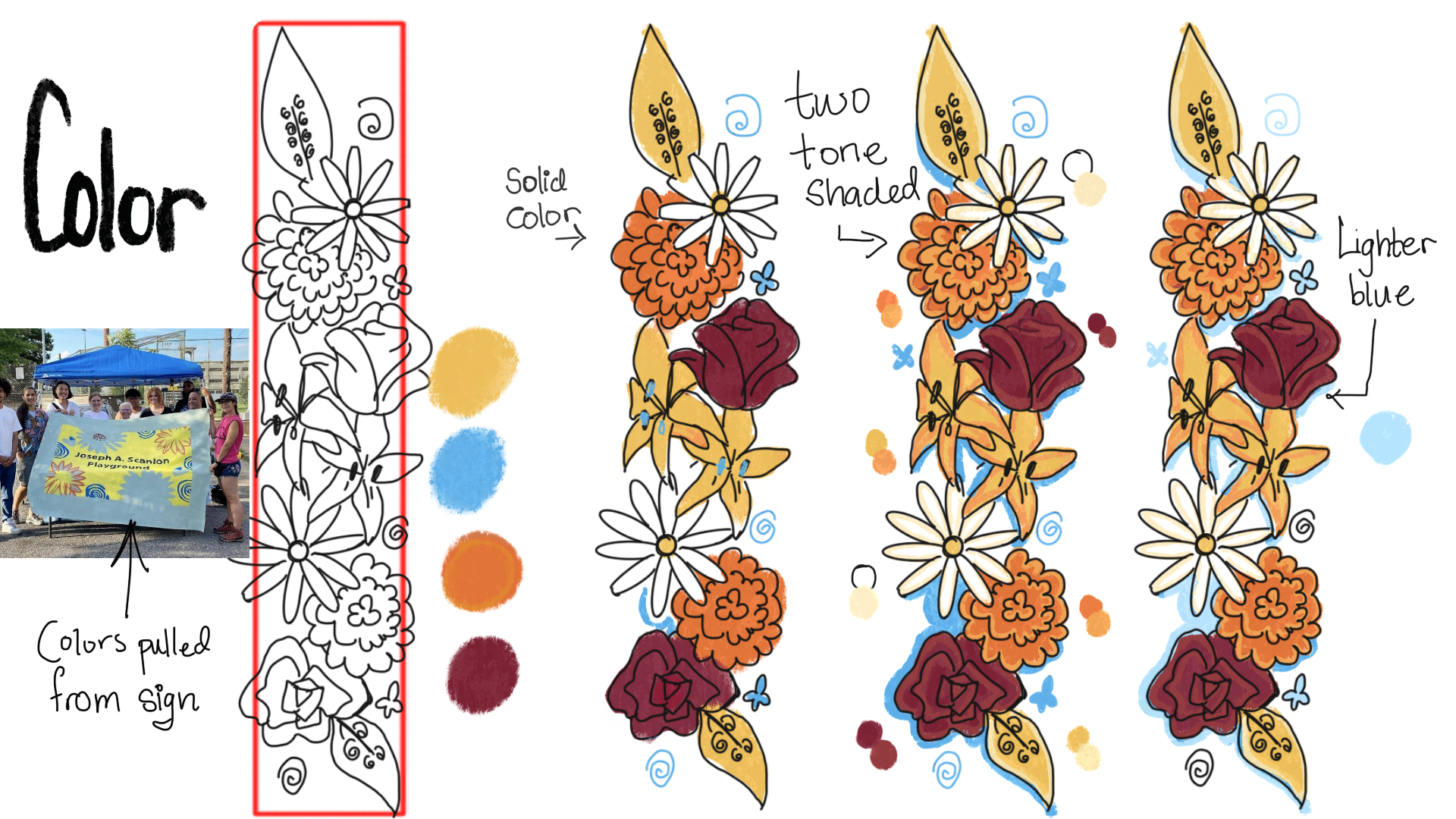
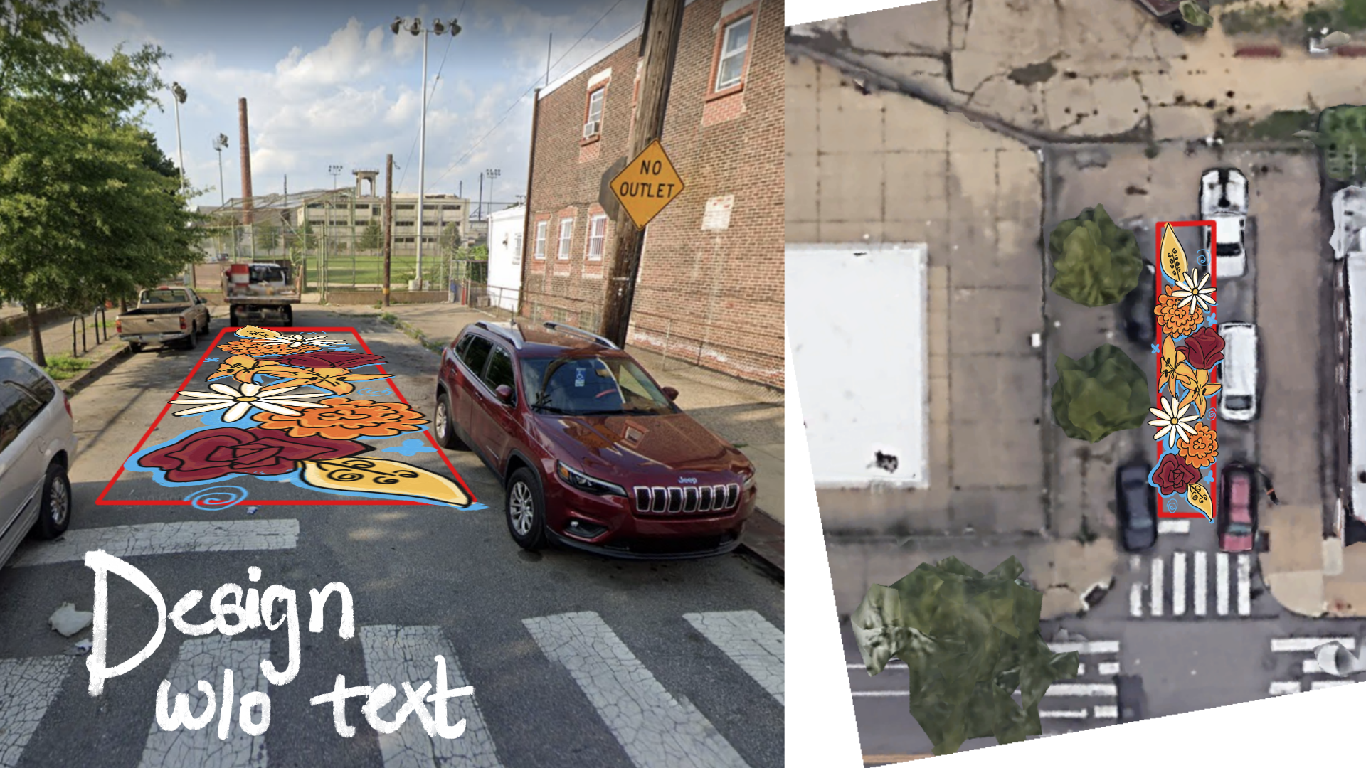
Forming the Image
The design grew from conversations, sketches and what we learned on site. We chose flowers to bring softness and color to the playground, but the palette itself came from a sign posted near the play area. Its bold, welcoming colors felt familiar to the neighborhood, so we adopted them for the mural!
Combining those colors with ideas from all the students helped us build a piece that felt rooted in the place and authentic to the people who use it every day. With guidance from our teacher, Carly Noella Najera, we blended our perspectives into a cohesive design that felt connected to Harrowgate’s visual identity.